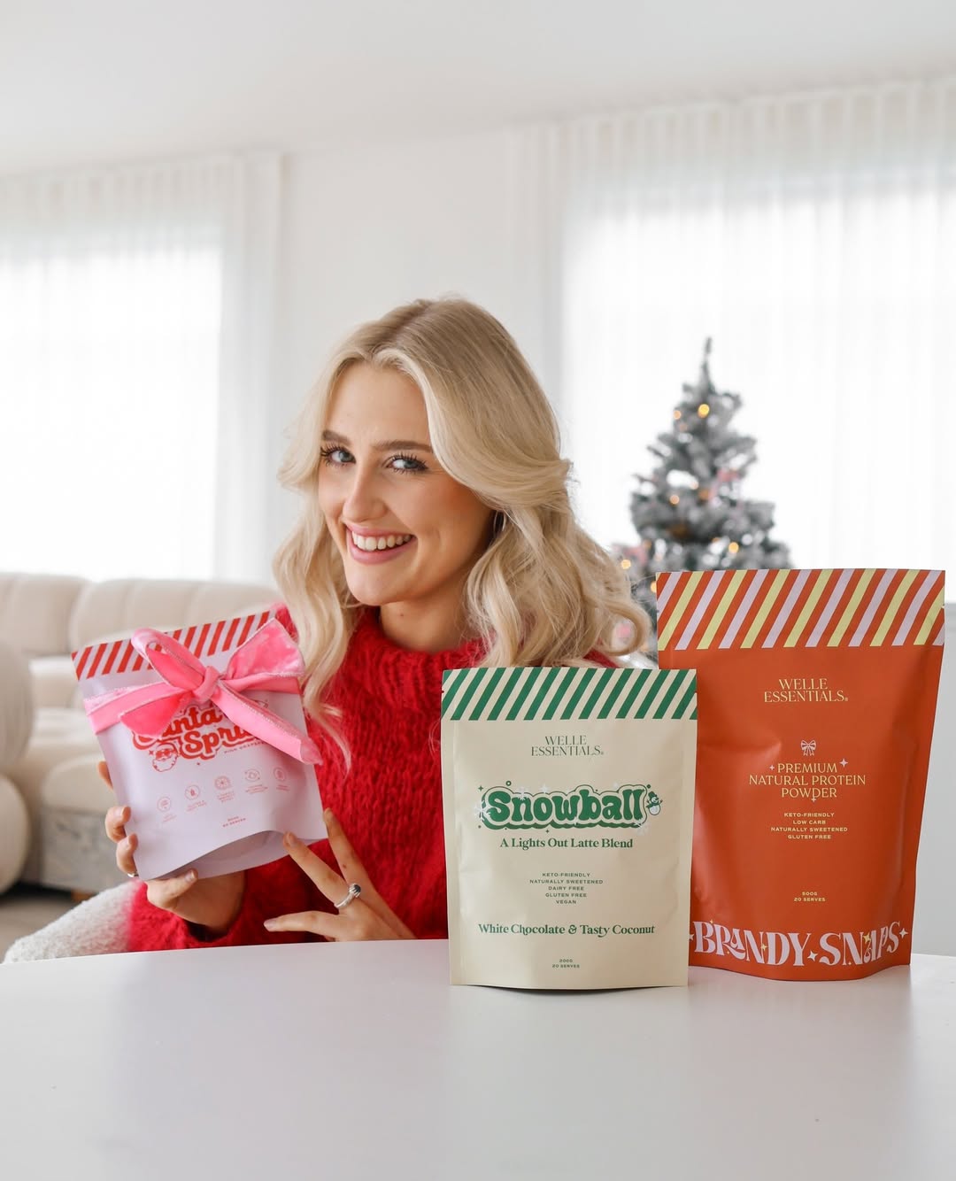
Packaging Design for Welle Essentials
I created a limited-edition Christmas packaging design for Welle Essentials, bringing a festive twist to their best-selling electrolyte range. The concept blends vibrant holiday accents and playful seasonal motifs while maintaining the brand’s clean, minimal aesthetic. The result is packaging that feels joyful, modern, and true to Welle’s wellness-driven identity.
Overview
Welle Essentials is a New Zealand-based wellness brand known for its clean formulations and modern approach to everyday health. Their best-selling electrolyte powders have become a staple among wellness enthusiasts looking to stay hydrated, energized, and balanced. For the holiday season, Welle wanted to create a limited-edition Christmas range that captured the festive spirit while staying true to their brand’s calm, minimal, and wellness-driven aesthetic.
The Solution
I designed a festive yet refined packaging concept that brought a fresh twist to Welle’s signature look. The creative direction centered on vibrant color accents, playful holiday motifs, and thoughtful typography that evoked the warmth and excitement of the season. The goal was to create packaging that could instantly stand out on shelves and in digital spaces, while still feeling authentically Welle: minimal, modern, and mindful.
The Outcome
The final packaging design perfectly captured the balance between holiday cheer and brand consistency. It added a sense of celebration to Welle’s product line, making hydration feel as joyful as the holidays themselves. The Christmas range quickly became a seasonal favorite, strengthening Welle’s brand identity and visual storytelling while connecting with both loyal customers and new audiences through festive appeal.

Elle Chrisp
Founder


